This guide brings together the visual language, design style, and core principles behind our brand, helping every team, regardless of role or expertise, create a consistent and recognizable experience. From digital platforms to printed materials, these guidelines make sure our brand comes through clearly at every touchpoint.
Logo
Download
Use the logo only as provided. Never skew, rotate, or edit it in any way.
Logo versions
Primary version

primary

primary white
primary on purple

primary stacked

primary stacked white

primary stacked on purple
Primary (stacked) white
For use on dark to black background color.
Primary (stacked) logo
Should be used whenever possible. If space is reduced, use the stacked version.
Primary (stacked) on purple
For use on the core purple color from the palette or darker color backgrounds where the core gradient in the mark doesn’t contrast enough.
colors
—
Purple Rain
HEX - #6B29C8
CMYK - 46.80.0.22
Iren Purple
HEX - #8656D5
CMYK - 37.60.0.16
Space Black
HEX - #14171A
CMYK - 23.12.0.90
White
HEX - #FFFFFF
CMYK - 0.0.0.0
Secondary version

secondary

secondary white
secondary on purple

primary stacked
primary stacked white
primary stacked on purple
Secondary (stacked)
For use when monochromatic version on a light background is required, e.g. when the Primary logo cannot be reproduced effectively (e.g. color restrictions on print, physical environmental applications, foiling).
Secondary (stacked) white
For use when monochromatic version on a dark background is required, e.g. when the Primary logo cannot be reproduced effectively (e.g., color restrictions on print, physical environmental applications, foiling).
Secondary (stacked) on purple
For use on the core purple color from the palette or darker color backgrounds where the core gradient in the mark doesn’t contrast enough.
colors
—
Iren Purple
HEX - #8656D5
CMYK - 37.60.0.16
Space Black
HEX - #14171A
CMYK - 23.12.0.90
White
HEX - #FFFFFF
CMYK - 0.0.0.0
Purple version

primary

stacked
Purple (stacked)
Use this version when a monochromatic logo needs to remain visible on both dark and light backgrounds. For example, in digital applications that switch between light and dark mode.
Logo construction
Primary version

2x
2x
2x
x
2x
The composition of the horizontal logo version consists of the brandmark horizontally bottom aligned with the flat letters of the logotype (wordmark). The size of the horizontal space (x) between the brandmark and wordmark equals four squares of the grid horizontally and vertically.
Stacked version
2x
2x
2x
2x
x

The stacked version is constructed with the brandmark at a 150% the size of the one in the primary logo, and the wordmark at 75% the size of the one in the primary logo, vertically center-aligned with the same vertical (x) space between the mark and the capital R.
Brandmark

x
1,5x
1,5x
1,5x
1,5x
The Resolute symbol is constructed on a square grid with precise proportions of each element of the symbol lying on the grid. All radiuses, angles, or lack of them are not to be changed or adjusted in any way.
The Resolute symbol (brandmark) can be used by itself (without the wordmark) as an identifier, preferrably after the Primary logo has been established in previous communications from Resolute, or at the least alongside the name in plain text. Such use cases include avatars on Social Media, favicons and icons in products and applications, inner content slides in presentations, brochures and use in interiors. The symbol should not be used in first point of contact instances (e.g. covers, letterheads, office reception) where only the Primary logo should be used.
Correct usage


On photographic backgrounds when there is enough contrast or the protograph is tinted.

On light and bright-toned backgrounds. Provides the contrast needed to stay legible.

On dark and low-light backgrounds. Provides the contrast needed to stay legible.
On colors form the brand palette when there is enough contrast.
On core gradients, provided the position allows for enough contrast.
For email signatures and similar cases where it’s going to be used on both light and dark backgrounds simultaneously.
The Resolute logo can be used as shown here. When placing it on gradients or photographs, make sure there's enough contrast between the brandmark symbol and the background. If the background is colored, it should generally use colors from the brand palette. If the background is photographic, place the logo over an area with ample white space, or apply transparency and/or a tint from the brand palette to the photograph.
On more complex backgrounds, such as textures or colors outside the brand palette, use the black or white version of the logo instead. These versions can also be applied with transparency for a more subtle, watermark-style effect.
Incorrect usage and placement
Don’t rotate or flip the logo or any of its individual elements.

Don’t skew or transform the logo in any way.

Don’t change the proportions of the logo’s separate elements.

Don’t move the elements in the logo lock-up.

Don’t place the “Primary white” logo on purple colors from the brand palette. Use the “Primary on purple” instead.

Don’t place the logo on colored backgrounds that don’t have enough contrast with even one of the colors in the logo. Avoid placing the logo on colors that don’t harmonize with the colors in the logo either.

Don’t change the color of any of the logo versions or colorize them.
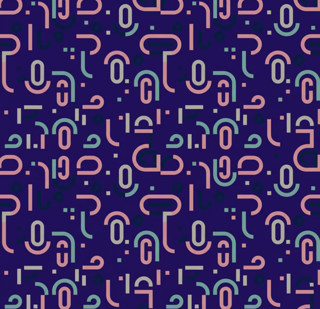
Don’t place the logo on a patterned or busy background, even if it’s in our brand colors.

Don’t outline the logo in stroke.
Don’t apply any effects to the logo - bevel, emboss, inner shadow, feather, etc.
Don’t apply any obvious outer glow or drop shadow effects. Use these only very subtly to enhance contrast, if necessary.
Don’t use transparency on the color versions of the logo. If needed, use it only on the black or white versions.
Logo badge
To complement our horizontal logo, we have developed a set of color-coded logo badges designed to provide clear visual differentiation between our main communication topics. These badges are intended for internal use only, and must always be used in conjunction with the logo, never as standalone elements.

CAREERS
CASE STUDY
EVENTS
ONBOARDING
RECRUITMENT
colors
—
Purple Rain
HEX - #6B29C8
CMYK - 78.86.0.0
Pantone - 266C
Galactic
HEX - #4423FF
CMYK - 81.76.0.0
Pantone - 2098C
Orchid
HEX - #7A8FFF
CMYK - 59.46.0.0
Pantone - 7452C
Aqua
HEX - #00CEFF
CMYK - 62.0.0.0
Pantone - 306C
Watermelon
HEX - #FD6A77
CMYK - 0.70.35.0
Pantone - 805C
AI Jumpstart logo
Download
AI Jumpstart is a brand of Resolute, developed to represent our first AI-oriented service. Its logo reflects our core visual identity while maintaining its own distinct presence. Always apply it in line with the guidelines set out in this brandbook.
The AI Jumpstart logo is built by duplicating an element from the Resolute logo, forming a star-like shape at its core. This approach conveys a sense of belonging to the Resolute brand and strengthens the visual connection between the two logos whenever they appear together. Structured this way, the shape comes together to form the 'AI spark' symbol at its center.

primary

primary white

secondary

secondary white
colors
—
Purple Rain
HEX - #6B29C8
CMYK - 46.80.0.22
Iren Purple
HEX - #8656D5
CMYK - 37.60.0.16
Space Black
HEX - #14171A
CMYK - 23.12.0.90
White
HEX - #FFFFFF
CMYK - 0.0.0.0
Color palette
Download
Our color palette is harmonious and engaging. It balances between the seriousness and simplicity of the core colors and the brightness and friendliness of the secondary and accent colors.
PURPLES
Dark Violet
HEX - #100731
CMYK - 100.100.42.65
Pantone
Deep Violet
HEX - #200F60
CMYK - 100.100.25.29
Pantone
Meteorite
HEX - #431C81
CMYK - 91.100.13.5
Pantone - 26
Purple Rain
HEX - #6B29C8
CMYK - 78.86.0.0
Pantone - 266C
Iren Purple
HEX - #8656D5
CMYK - 60.73.0.0
Pantone - 265C
Lavender
HEX - #AE93E2
CMYK - 33.44.0.0
Pantone - 2645C
Purple Sand
HEX - #C4B7EA
CMYK - 22.27.0.0
Pantone - 2635C
Nostalgia
HEX - #DBD7F7
CMYK - 12.14.0.0
Pantone
BLUISH & TINTS
Dark Blue
HEX - #09023A
CMYK - 97.94.39.59
Pantone
Deep Blue
HEX - #14084D
CMYK - 100.100.29.43
Pantone
Galactic
HEX - #4423FF
CMYK - 81.76.0.0
Pantone - 2098C
Demir Blue
HEX - #5252FF
CMYK - 76.69.0.0
Pantone - 2125C/
Orchid
HEX - #7A8FFF
CMYK - 59.46.0.0
Pantone - 7452C
Bluish
HEX - #A1B0FF
CMYK - 40.27.0.0
Pantone -
Cotton
HEX - #D7DDFF
CMYK - 13.10.0.0
Pantone -
First Snow
HEX - #E7EEF9
CMYK - 9.3.0.0
Pantone
NEUTRALS
Space Black
HEX - #14171A
CMYK - 76.68.63.78
Pantone
Young Night
HEX - #212529
CMYK - 76.67.61.68
Pantone
Comet
HEX - #4F566C
CMYK - 73.63.40.20
Pantone -
Zen Gray
HEX - #A1A9BB
CMYK - 38.28.17.0
Pantone - 2125C/
Morning Chill
HEX - #CED4E2
CMYK - 18.12.4.0
Pantone - 7452C
Cloudy Day
HEX - #D7DEEC
CMYK - 8.5.0.7
Pantone -
Venus
HEX - #F1F2F3
CMYK - 5.2.2.0
Pantone -
White
HEX - #FFFFFF
CMYK - 0.0.0.0
Pantone -
ACCENT
Aqua
HEX - #00CEFF
CMYK - 62.0.0.0
Pantone - 306C
Cyan
HEX - #06F4ED
CMYK - 70.0.20.0
Pantone - 319C
Minty Paradise
HEX - #00FEC1
CMYK - 55.0.35.0
Pantone - 2098C
Icery
HEX - #A3FBE4
CMYK - 31.0.19.0
Pantone - 2125C
Star
HEX - #FFE500
CMYK - 2.4.99.0
Pantone - Yellow C
Saturn
HEX - #F8EFAE
CMYK - 0.4.30.2
Pantone - 0301C
Peachy
HEX - #FFC183
CMYK - 0.27.52.0
Pantone -
Watermelon
HEX - #FD6A77
CMYK - 0.70.35.0
Pantone - 805C
Calypso
HEX - #FF9EAA
CMYK - 0.50.21.0
Pantone - 1765C
Gradients
Our gradients are created using colors from our brand palette, reflecting the flexibility and sense of togetherness at the core of our identity. Use them sparingly - typically one at a time - to avoid overwhelming the composition or diluting the brand.Below, you'll find some of our most commonly used gradients, organized by category. The full list of gradients is available in our design library.
Background
Here’s a list of our most commonly used gradients for background in dark theme:
Dark Violet
100%
Deep Violet
100%


Type: Linear
Dark Violet
100%
Galactic
100%


Type: Linear
Meteorite
100%
Dark Violet
100%

Type: Linear
If you have a white background and want to add a subtle touch of color, you can apply one of these radial gradients:
Meteorite
100%
Galactic
40%
Galactic
0%


Type: Radial
Meteorite
100%
Bluish
100%
Bluish
0%


Type: Radial
Accent headings
For headings, where we want to add extra emphasis to a title, we apply a gradient directly over the text. These gradients are color-coded to specific topics or sections in our design library. Below are examples in the bluish and purple tints:
Dark Blue
100%
Orchid
100%

Type: Linear
Purple Rain
100%
Purple Rain
100%
Deep Violet
100%


Type: Radial
Visual elements
We also use gradients in visual elements where we want to add extra emphasis or elegance:
Deep Violet
100%
Calypso
100%

Type: Linear
Galactic
0%
Galactic
100%

Type: Linear
Typography
Primary font - Silka
Download
Silka is our primary brand font. It comes in a variety of weights, but to keep things consistent across our brand, please use only the weights shown below.It's offered by Atipo Studio on a pay-what-you-want basis. Please make sure to license it accordingly.
Silka Bold
abcdefghijklmnopqrstuvwxyz ABCDEFGHIJKLMNOPQRSTUVWXYZ 1234567890£&@?!/+(.,:;)
SUGGESTED USAGE
—
For (smaller) headlines (e.g., on the website H2, H3, H4). For emphasis when introducing content within content. For highlighting words or phrases within body copy (bold text). This weight is too bold to be used for long passages of text.
Silka Semibold
abcdefghijklmnopqrstuvwxyz ABCDEFGHIJKLMNOPQRSTUVWXYZ 1234567890£&@?!/+(.,:;)
SUGGESTED USAGE
—
For headlines where the message requires smaller emphasis. Use this in place of Silka Bold when used in bigger size, so as not to overwhelm. This weight is also too bold to be used for long passages of text, but may be used for short introductory paragraphs.
Silka Medium
abcdefghijklmnopqrstuvwxyz ABCDEFGHIJKLMNOPQRSTUVWXYZ 1234567890£&@?!/+(.,:;)
SUGGESTED USAGE
—
For body copy or small text in campaign collateral. This weight is too light to be used for headlines and subheadlines within body copy, but can be used in ALL CAPS with some letter-spacing to provide alternative for captions and small headlines.
Silka Regular
abcdefghijklmnopqrstuvwxyz ABCDEFGHIJKLMNOPQRSTUVWXYZ 1234567890£&@?!/+(.,:;)
SUGGESTED USAGE
—
For body copy and subheadlines in campaign collateral. This weight is too light to be used for headlines and subheadlines, but should be the most commonly used weight for most text and long paragraphs.
Secondary font - Archia
Download
Archia is our secondary font. Secondary and supporting fonts give us the flexibility to establish more complex or nuanced hierarchy within a composition.
Archia Bold
abcdefghijklmnopqrstuvwxyz ABCDEFGHIJKLMNOPQRSTUVWXYZ 1234567890£&@?!/+(.,:;)
SUGGESTED USAGE
—
For additional contrast within complex documents and the website. Use in big headlines and display text. In smaller size, use in sidebar headers, pull quotes and accents to provide for contrast and visual impact across communications.
Archia Semibold
abcdefghijklmnopqrstuvwxyz ABCDEFGHIJKLMNOPQRSTUVWXYZ 1234567890£&@?!/+(.,:;)
SUGGESTED USAGE
—
Use interchangeably with Archia Bold, where a really big size text is required and/or it looks too heavy.
Supporting font
Silka Mono Medium
abcdefghijklmnopqrstuvwxyz ABCDEFGHIJKLMNOPQRSTUVWXYZ 1234567890£&@?!/+(.,:;)
SUGGESTED USAGE
—
Use for small accents, captions, code snippets. Also interesting to use in all caps.
Substitute font
Aptos
#
Latin
#
Cyrillic
abcdefghijklmnopqrstuvwxyz ABCDEFGHIJKLMNOPQRSTUVWXYZ 1234567890£&@?!/+(.,:;)
SUGGESTED USAGE
—
When Silka and Archia are not supported due to technical or platform limitations, such as those in email clients, PowerPoint, or Word templates, Aptos is the officially approved substitute. Aptos is selected for its wide availability, reliability, and accessibility across all operating systems. No other substitute fonts are permitted unless explicitly approved by the Resolute design team.For Cyrillic text, Aptos is also the officially approved font. As part of the Microsoft Office package, it is available to everyone by default. To ensure the text displays with proper Bulgarian Cyrillic letterforms (rather than Russian Cyrillic), users must set the language of the text to Bulgarian in Word/Office (Review → Language → Set Proofing Language), which triggers the font's built-in Bulgarian glyph substitutions.
Type hierarchy
#
Digital
Differences in type size, weight, and font should always be clearly distinguishable. This contrast is what creates clean, consistent designs and a clear hierarchy of information.Make sure to leave plenty of line spacing (leading), especially in body copy, and pay attention to optical letter spacing (kerning) for the best legibility. When using all caps, add extra letter spacing (tracking); it improves both legibility and visual interest.
Body
Body Bold
Archia Bold
18px / 28.8pt
16px / 160px
Body bold paragraph
Body Semibold
Archia Semibold
18px / 28.8pt
16px / 160px
Body semibold paragraph
Body Medium
Archia Medium
18px / 28.8pt
16px / 160px
Body medium paragraph
Body Regular
Archia Regular
18px / 28.8pt
16px / 160px
Body regular paragraph
Headings
H1
Archia Semibold
80px / 104px
42px / 120px
Big title
H2
Archia Semibold
48px / 62.4px
28px / 120px
Section title
H3
Archia Semibold
28px / 39.2px
24px / 130px
Content title
Subtitle
Silka Medium
24px / 31.2px
18px / 130px
Subtitle text
H4
Archia Semibold
20px / 28px
20px / 140px
Small title
Overline L
Silka Mono Medium
20px / 24px
20px / 24px
overline L —
Overline S
Silka Mono Medium
16px / 19.2px
16px / 19.2px
overline S —
Type hierarchy
#
When it comes to print type sizes may vary depending on the media. Always keep the visual hierarchy structured. If you feel it brings your design together, feel free to use the italic versions of the fonts.
Title
Archia Semibold
Title
Subtitle
Silka Regular
Title
Emphasized Title
Archia Bold
Emphasized title
Body text
Silka Regular
We design, build, modernize and reinvent your software to help you surpass business objectives.
Small accent
Silka Mono Medium
small accent —
Accent headings
#
Digital
#
To emphasize text, we carry the concept of transparency through into our headlines, which are filled with radial gradients, centered or offset, depending on what the design calls for.
Archia Semibold
Accenttitle
Iconography
For our iconography we use
FontAwesome
We want our designs to feel modern while relying on a consistent, dependable icon style that's still flexible and easy to work with. We appreciate the range that Font Awesome offers, so we've chosen to use all of its variations, each for a different purpose. The pack includes every brand logo we're likely to need, along with a huge library of predefined icons for nearly any use case, including UI elements like arrows and toggles.
For accents, we like using the duotone style, since it adds visual interest without pulling focus away from the content. In text-heavy contexts, especially, we find this to be a subtle but effective approach.
font
—
icons example
—
Pro Thin
Pro Light
Pro Regular
Pro Solid
Resolute Kit
Visual language
Brand shapes
For our brand shapes, we stick to familiar, well-known geometric forms. To give them a more modern, technological feel, we always round the corners, either fully or partially, depending on how the shape is used.
These shapes can serve as backgrounds, accents, or containers for any type of content. Whenever possible, we apply a frosted glass effect to them; when that's not feasible, the best alternative is to blur or layer shapes using different levels of transparency to simulate depth. As shown, shapes can also be combined using different fill colors or transparency levels.


Layered approach
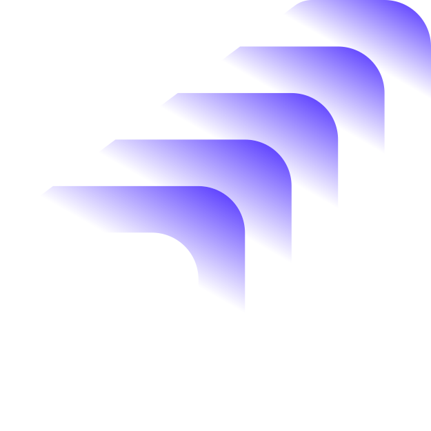
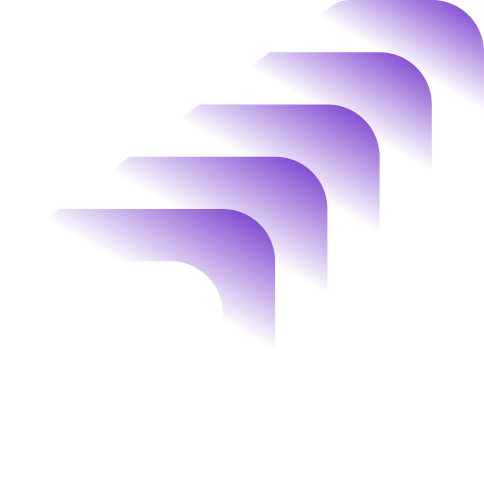
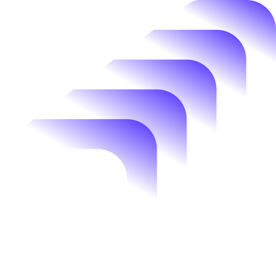
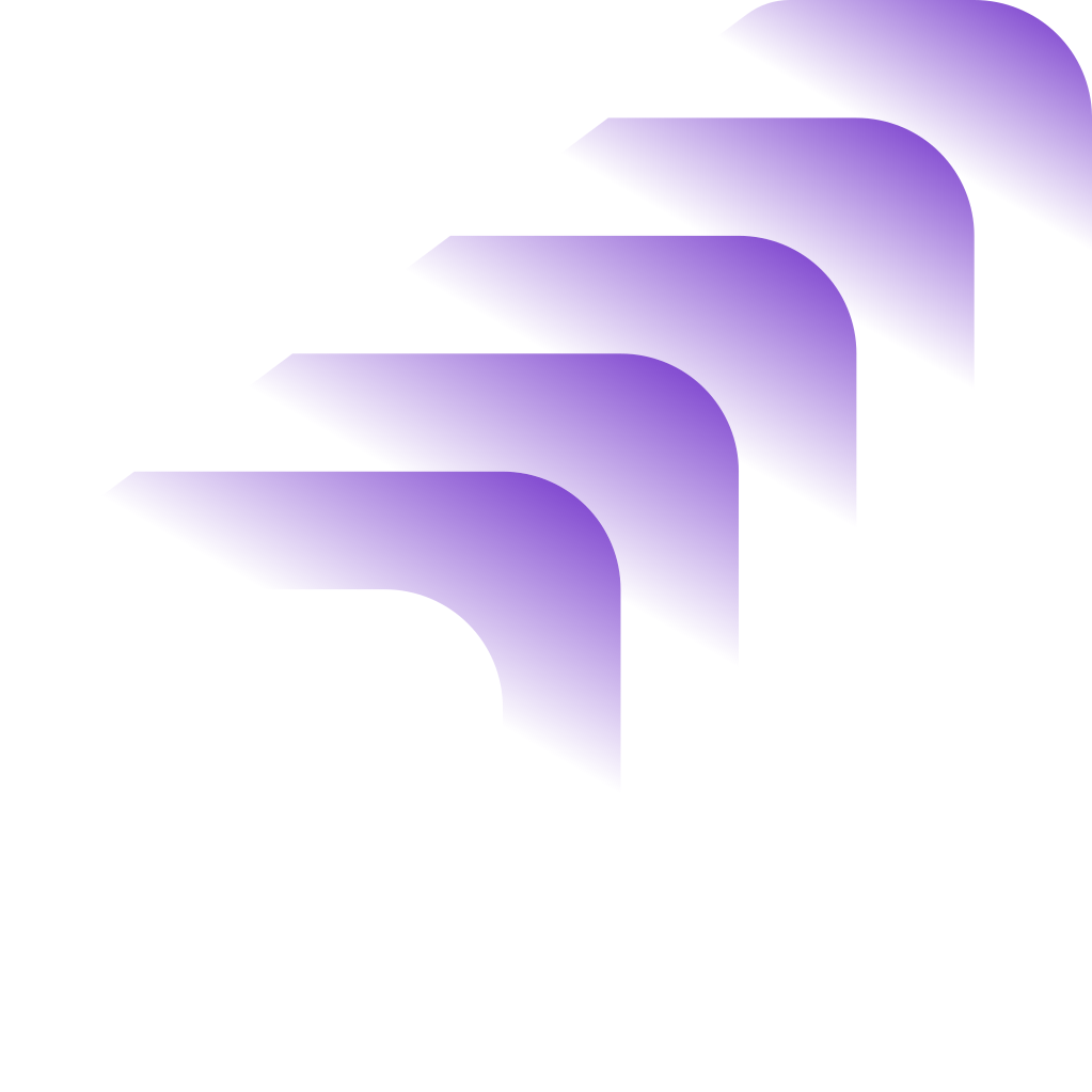
Derived from a shape in our logo, we extended this tech-inspired glass effect by layering objects and letting them dissolve into the background. We use this method whenever we want to subtly emphasize meaning or make a background more visually interesting.
We create this effect by applying a simple linear gradient as the fill for our chosen shape, keeping full opacity at one end and fading to 0% at the other. The gradient is positioned diagonally, so the bottom edge of the shape appears to disappear into the background, adding a sense of depth.
You can apply this approach to any icon from our font or to any basic shape.


Graphic visual language
The most important elements of our digital visual language are gradients and transparency. We use a 'glass effect' overlay throughout all of our materials, applying brand shapes with transparency to reinforce our tech-forward feel and add a splash of color.
A second set of shapes is designed to be used exclusively with our simple gradients, on solid backgrounds. We like how they appear to 'dissolve' into the background. Please keep this effect intact. These shapes are best suited for digital visual communication and can be used large and cropped as backgrounds, alongside text, or as subtle visual accents. You can also use them as inspiration to create similar visuals, pairing them with a contextually relevant, solid icon from our icon pack.
Photographs
Photographs with people should:
Feel candid, natural, and unstaged
Avoid a studio look, favoring a documentary-style feel instead
Capture an authentic, in-the-moment shot
Convey a sense of team spirit and collaboration
Include enough whitespace for visual breathing room
Feature a person or a piece of hardware (computer, tablet, or phone) displaying software on its screen
Be cropped as needed, while still retaining a clear focal point


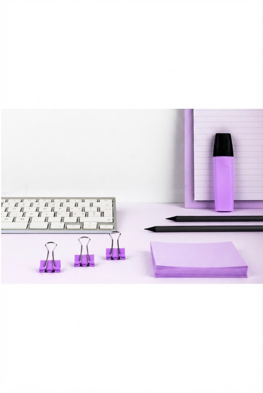
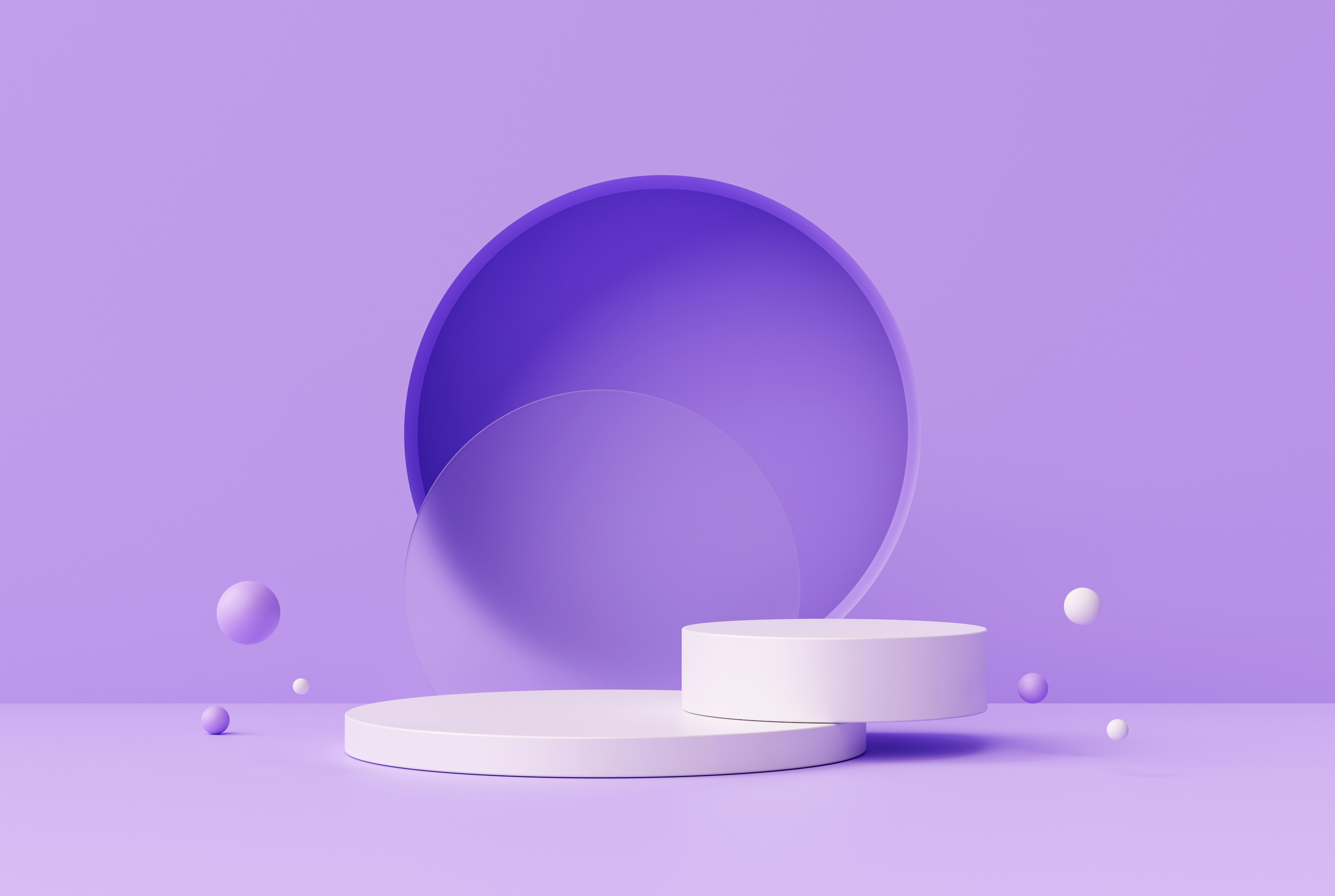
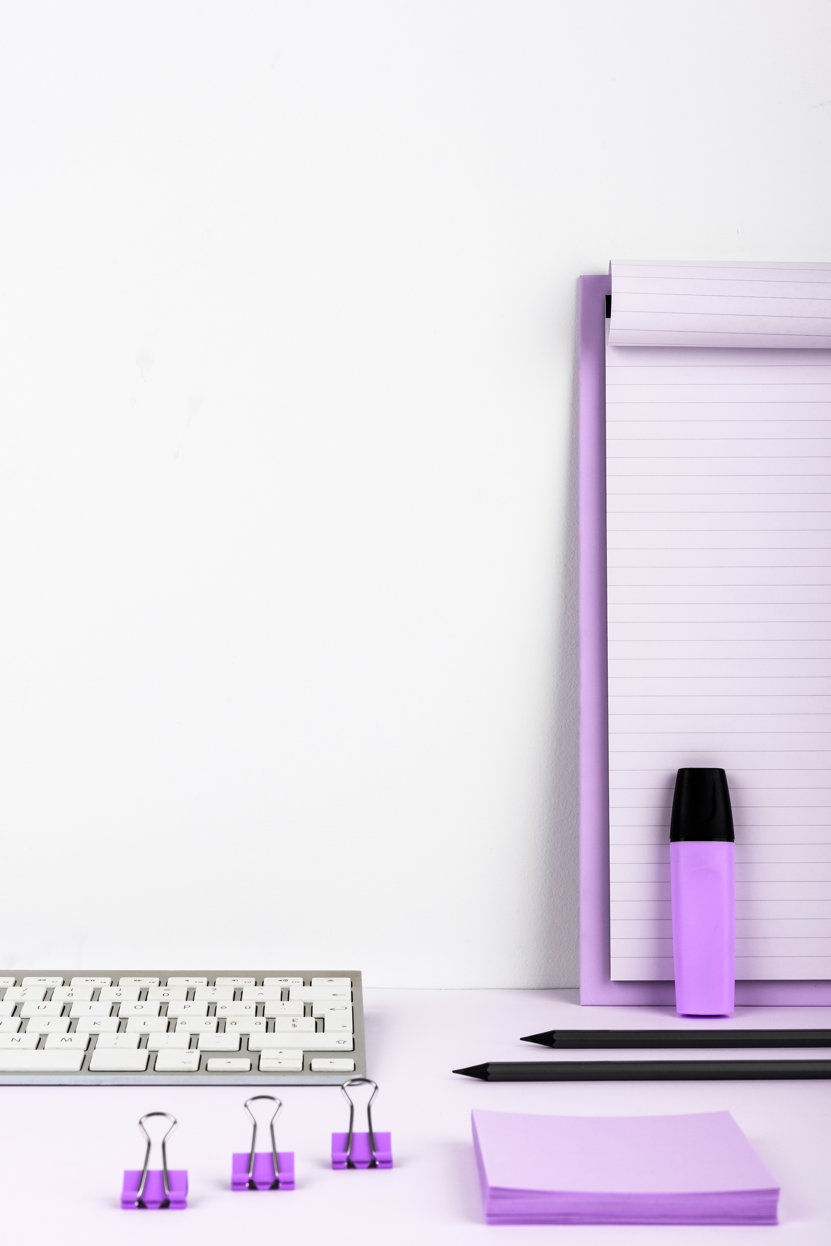
Photographs with objects should:
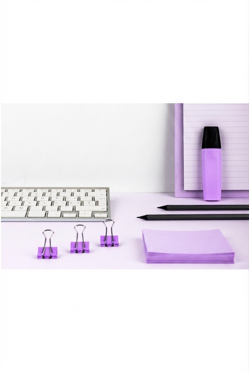
Have bright, vivid colors
Include a purple accent or fall mainly within the purple spectrum
Have an interesting, unconventional layout
Feature a hero object or clear main focus
Digital examples
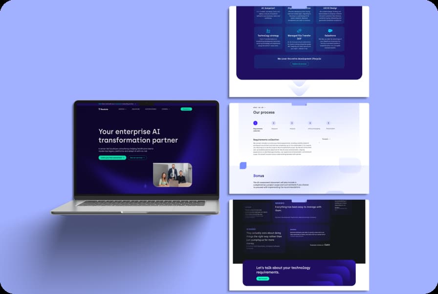
UI in action
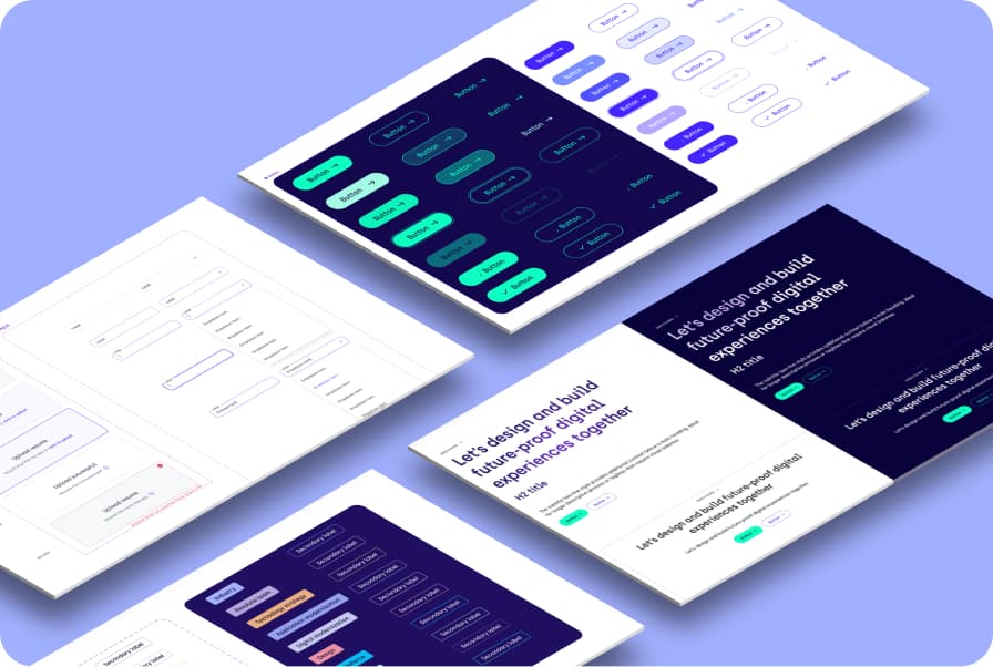
As mentioned above, we have a complete UI library developed by our designers, ranging from basic elements to fully functional sections and components.
Brand awareness
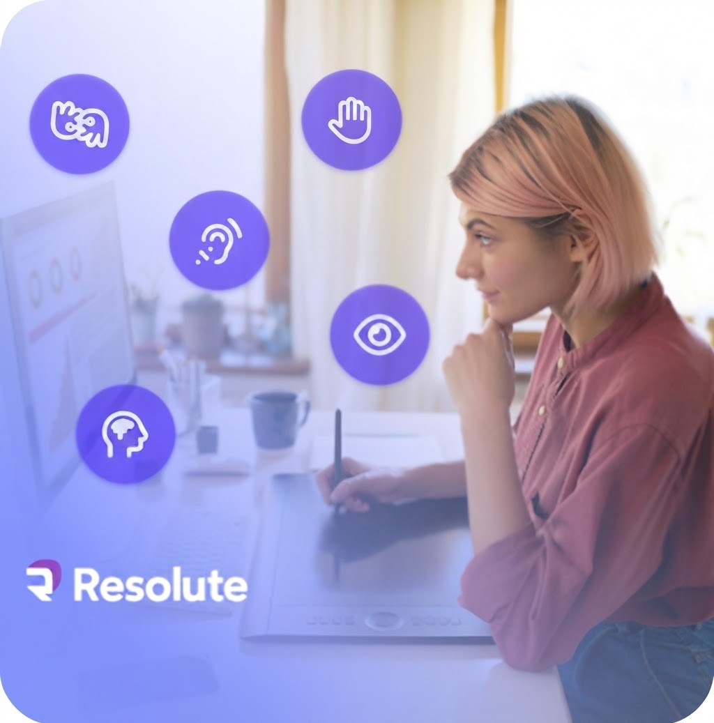
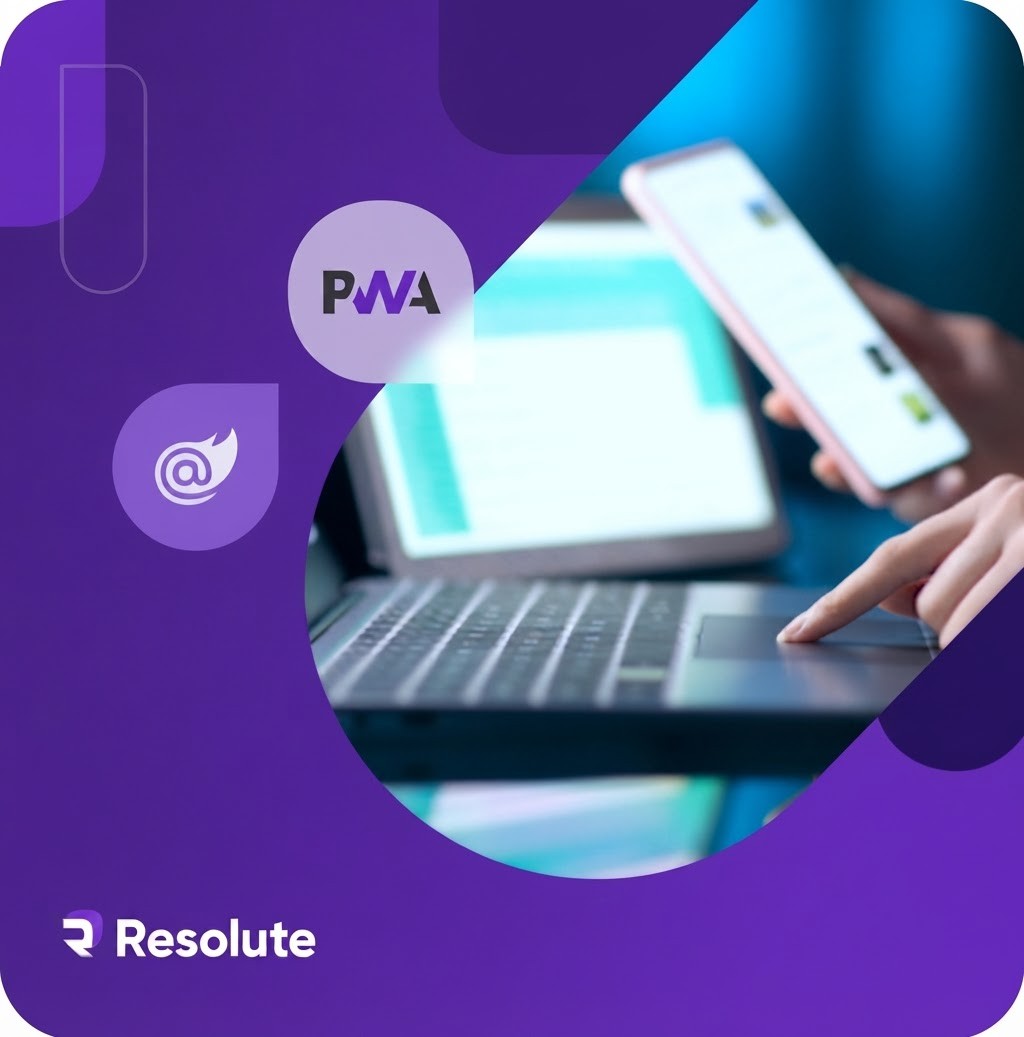
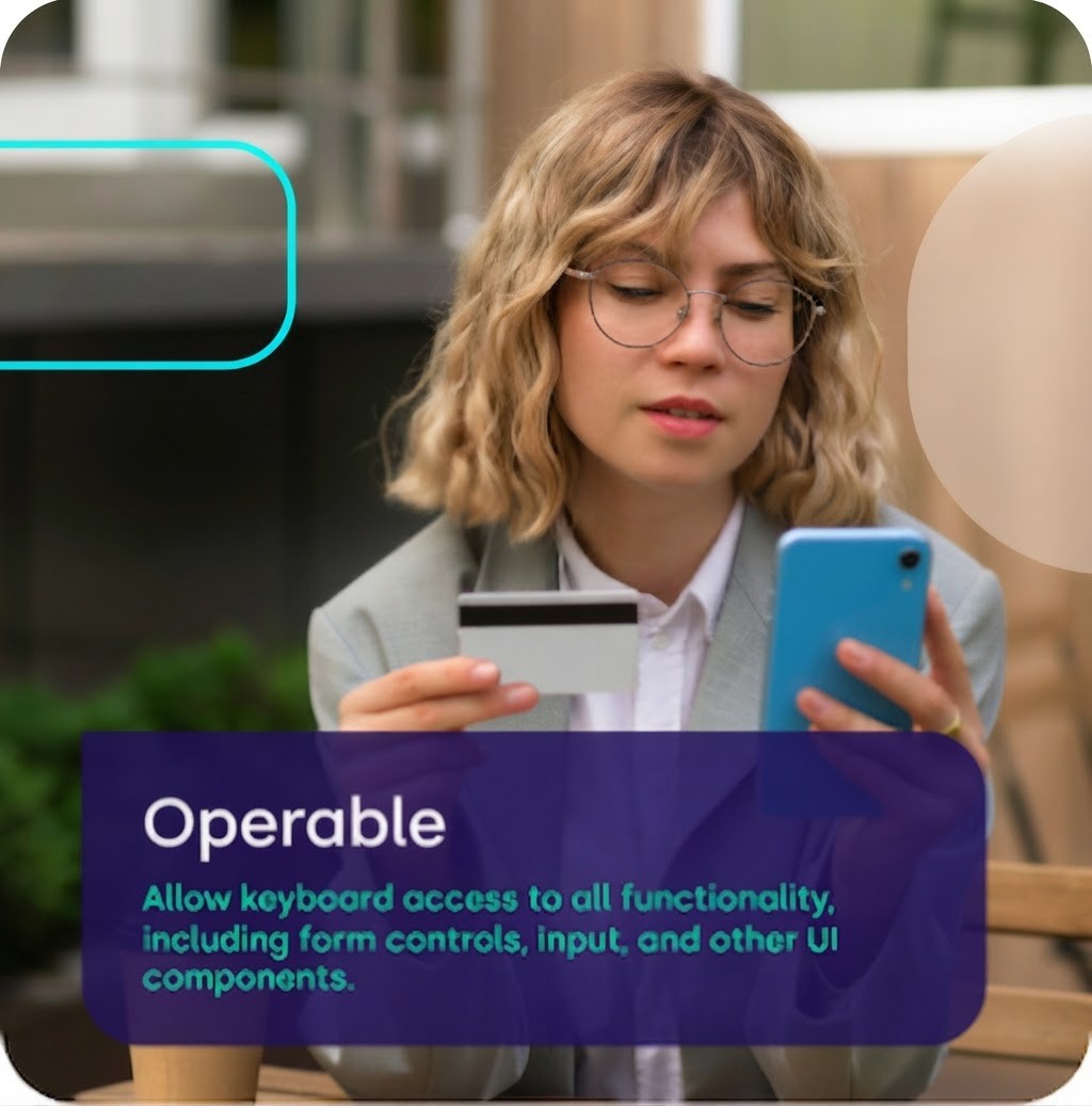
We believe that using photographs brings out the human side of our brand. Our company is people-oriented at its core, and we want that to come through in our digital communication. That said, we know that plain photographs alone won't set us apart from other companies. That's why we love using shapes from our pattern as overlays on images throughout our digital communication - our core gradients work perfectly as fill colors for this purpose. When possible, feature purple as an accent or background color, and consider adding a minimalistic illustration to the photograph as well.
When creating content for external sources, always include our logo in a corner of your choice, making sure it's visible by selecting the right color combination and size for the content. If you're creating visuals for one of our main topics, don't forget to add the corresponding topic tags.Here are some live examples from our visual communication:



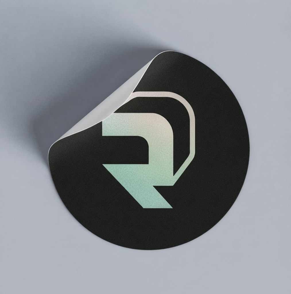
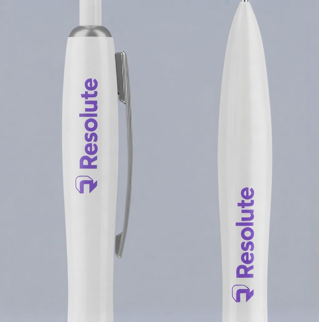
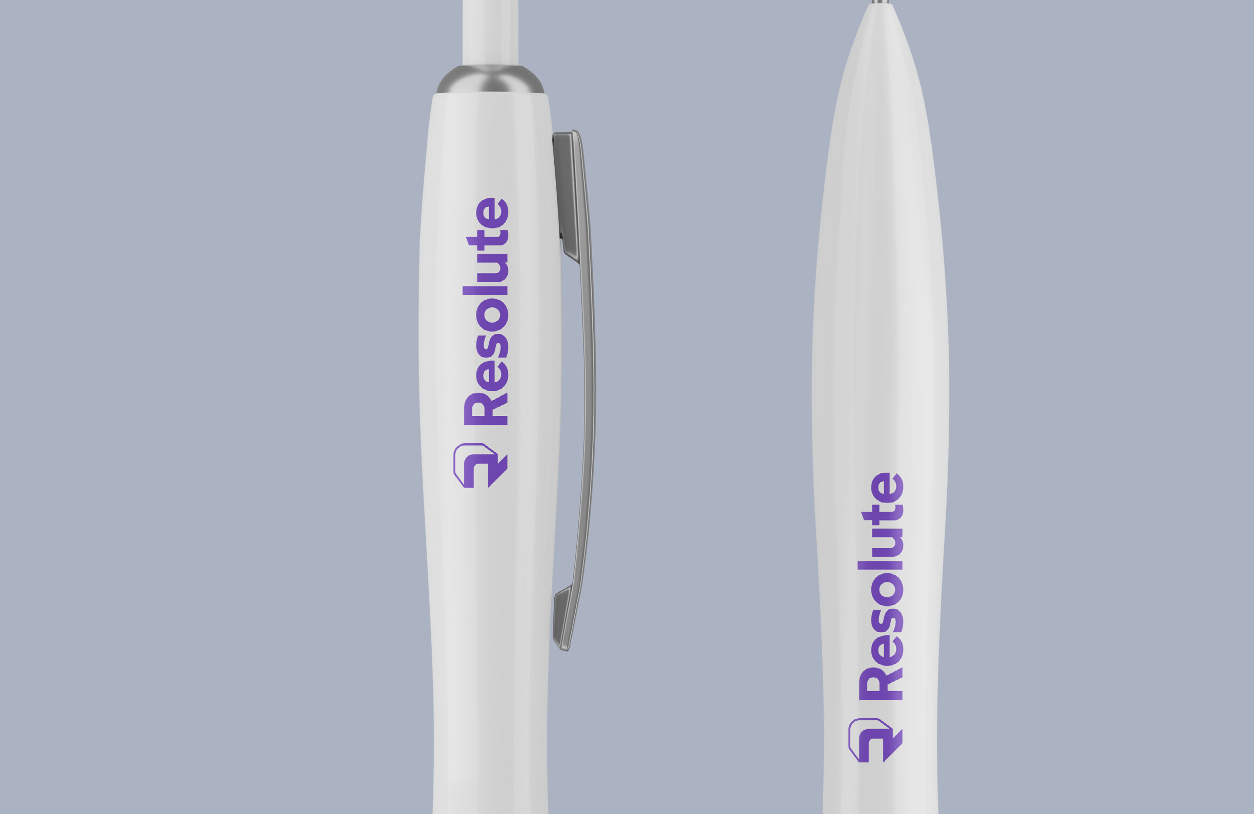
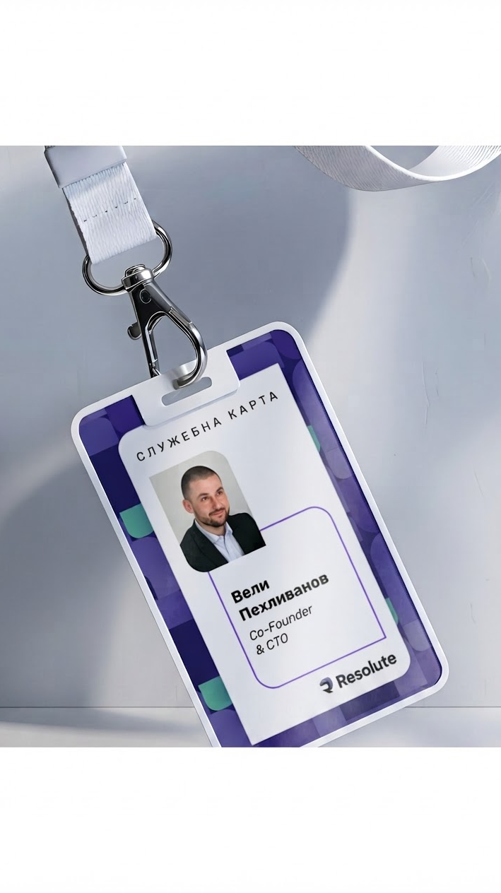
Print examples
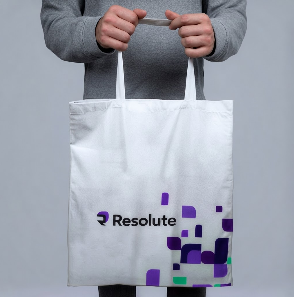
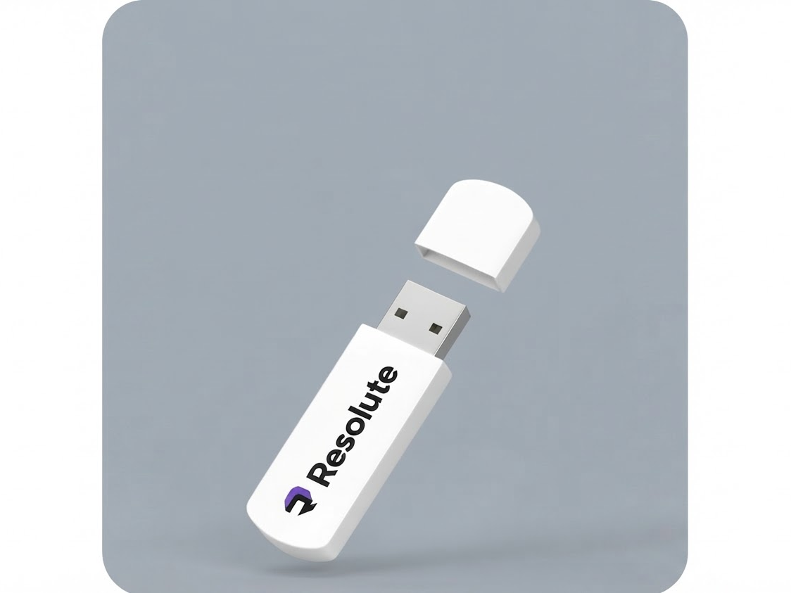
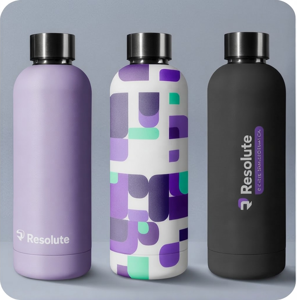
Our brand identity extends seamlessly into print, maintaining the same visual language, colors, and design principles used across our digital materials. Below are a few examples showing how our brand comes to life in print.
Resolute Brand Guidelines v. 07/2023


51
Tone of voice
Foundations
Brand purpose
Resolute exists to help organizations solve complex software and AI engineering problems in ways that are sustainable, secure, and practical. By combining modern engineering practices with proven delivery experience, the company helps clients modernize critical systems, adopt AI responsibly, and build technology that continues to deliver value long after implementation.
Target audience
Resolute speaks to engineering leaders, CTOs, CIOs, VP Engineering, Heads of Digital Transformation, technical product leaders within medium and large organizations, particularly those operating in regulated industries such as healthcare, aerospace, fintech, and the public sector.
These are experienced decision-makers who value technical depth over marketing promises. They aren't looking for another technology vendor; they're looking for a partner who understands the realities of engineering at scale.
What our audience already believes
Our audience is surrounded by exaggerated claims about AI and digital transformation. They've seen too many vendors promise revolutionary results without understanding the realities of production systems.
They know modernization is difficult. They know AI is easy to demonstrate but much harder to run reliably in production. They understand that security, compliance, and governance aren't obstacles, they're requirements.
What they want is a partner who understands those constraints instead of trying to work around them. Resolute should reinforce the feeling that it understands real-world engineering complexity rather than selling idealized futures.
Three words we should never sound like
- Hype-driven
- Corporate
- Overconfident
If Resolute were a person at a party...
Resolute is the experienced engineer people naturally gravitate toward once the conversation moves beyond small talk. It listens before it speaks, asks thoughtful questions, and explains complex topics in a way that's easy to understand without oversimplifying them.
It doesn't dominate the room or try to impress people with jargon. Instead, it earns respect through insight, experience, and the confidence that comes from having solved similar problems before.
Tone dimensions
Funny
Serious


90% Serious
Engineering decisions have real consequences. The writing reflects that. We don't use humor to make ourselves memorable, we rely on clarity and good thinking.
Casual
Formal
60% Formal
Professional, but conversational. We write like people, not institutions.
Irreverent
Respectful
100% Respectful
We assume our audience is experienced. We explain without lecturing and disagree without dismissing.
Enthusiastic
Matter-of-fact
70% Matter-of-fact
We'd rather show results than celebrate them. When we sound enthusiastic, it's because we've solved an interesting problem, not because we're launching another feature.
Voice vs. tone
Our voice
Resolute is calm, thoughtful, and quietly confident. It speaks from experience rather than authority. It doesn't chase attention or try to sound smarter than the reader. It explains difficult engineering topics in plain language, backs up its opinions with real examples, and leaves room for conversation instead of delivering absolutes.
Onboarding
Friendly and reassuring. Help people get started without overwhelming them.
Errors or outages
Calm, transparent, and accountable. Say what happened, what's being done, and what comes next.
Marketing
Lead with the problem. Teach before you sell. Confidence comes from specifics, not adjectives.
Customer support
Patient and solution-focused. Acknowledge frustration without becoming overly apologetic.
Legal, billing, security
Clear, precise, and free of unnecessary marketing language.
Celebrating success
Celebrate the customer more than ourselves. Keep it genuine.